If you're wondering what the differences are between mobile SEO vs. desktop SEO, you'll find this guide refreshing.
SEO has become a crucial aspect of any successful online marketing strategy. However, with the increasing popularity of mobile devices, it's essential to understand the differences between mobile SEO and desktop SEO.
As user behavior and search engine algorithms adapt to the growing mobile trend, businesses must optimize their websites accordingly to remain competitive.
In this article, we'll explore mobile SEO vs. Desktop SEO and provide insights on how to effectively optimize your website for both platforms to maximize your online visibility and reach your target audience.
In This Article
Why Is Mobile SEO Important?
Mobile devices have become the primary way people access the internet.
The shift has significantly changed the way people search for information, products, and services online.
As a result, mobile SEO has become increasingly important for businesses to reach and engage with their target audience.
- An estimated 60% of all web traffic comes from mobile users.
- Some 76% of people who search on their smartphones for local businesses, visit that business within 24 hours and 28% of those visits end with a purchase.
- By 2025, an estimated 72% of people will use their mobile phone exclusively to access the web.
Search is Evolving
As a result, search is changing and user experience can influence your rankings.
- Mobile-first indexing: Google primarily uses the mobile version of a website for ranking and indexing purposes. This makes it essential to optimize your mobile site to ensure better visibility in search results.
- User experience: Mobile users have different needs and expectations compared to desktop users. They often look for quick, concise information and easy navigation. Optimizing your mobile site for user experience can lead to higher engagement, lower bounce rates, and improved conversions.
- Local search: Mobile devices are often used for local searches, such as finding nearby shops, restaurants, and services. Optimizing your mobile site for local SEO can help you attract more foot traffic and grow sales.
- Competitive advantage: With the majority of internet traffic coming from mobile devices, businesses that prioritize mobile SEO can gain competitive advantage over those that don't.
- Increased visibility: Mobile-optimized websites tend to rank higher in mobile search results, leading to increased visibility and organic traffic. This can translate into more leads, sales, and revenue for your business.
By understanding the importance of mobile SEO and implementing effective strategies to optimize your mobile site, you can get traction on your goals.
Now let’s take a look at the differences between searching on desktop vs. mobile. This will open up new insights.
The Search Experience: Mobile vs Desktop
Mobile devices not only present a different form factor, they’re used in unique ways. As you approach mobile SEO, it’s worth keeping these unique uses in mind.
Here are some key distinctions:

- User intent: Mobile searches tend to be more immediate, local, and action-oriented, such as looking for nearby businesses, quick answers, or directions.
- Search queries: Mobile users often use shorter, more concise search queries due to the limitations of mobile keyboards and the on-the-go nature of mobile searching.
- Voice search: Mobile users are 3 times as likely to use voice search and over 40% of those search results are pulled from featured snippets.
- Location-based searches: Mobile devices are more likely to be used for location-based searches and have built-in GPS capabilities. This allows for more targeted, localized search results. It’s crucial that your business information (also called NAP), including location and operating hours are accurate across the web.
- Page load speed: Mobile users are typically less patient and expect faster load times compared to desktop users. This is particularly true with the advent of 5G. Slow-loading websites can lead to higher bounce rates and lower search rankings on mobile.
- Click-through rates: Mobile search results tend to have lower click-through rates compared to desktop results, as users are more likely to scroll through multiple results or refine their queries on mobile devices.
- User experience: Mobile search results prioritize websites that offer a seamless, mobile-friendly user experience. Factors like responsive design, easy navigation, and touch-friendly elements are crucial for mobile optimization.

So, what about the similarities between mobile SEO vs. desktop SEO?
Mobile SEO vs. Desktop SEO: Similarities
While there are significant differences between mobile and desktop SEO, everything you already know about on-page SEO applies to mobile SEO.
That should put to rest a lot of the confusion you may have on the mobile SEO topic.
Put another way, anything you do to optimize your site benefits your SEO, regardless of the devices used to access your site.
Here are some specific ways in which mobile SEO and desktop SEO are the same:
- Local SEO: Optimizing your site for local SEO involves claiming and optimizing a Google Business Profile, including local keywords in your content, and ensuring that your website is listed in local directories. Managing Google Reviews is key, too, as most searchers are swayed by these.
- Keyword research: Regardless of the platform, keyword research remains a fundamental aspect of SEO. Identifying relevant keywords and incorporating them naturally into your content is essential for both mobile and desktop optimization.
- Quality content: High-quality, informative, and engaging content is crucial for both mobile and desktop SEO. Search engines prioritize websites that provide value to users, regardless of the device they use to access the content.
- Backlinks: Building high-quality backlinks from reputable sources is important for both mobile and desktop SEO. These links signal to search engines that your website is trustworthy and authoritative.
- Page speed: Fast loading times are crucial for both mobile and desktop users. Slow-loading pages can lead to higher bounce rates and lower engagement, which can negatively impact your SEO performance on both platforms.
- Security: Implementing HTTPS and ensuring your website is secure is important for both mobile and desktop SEO. Secure websites build trust with users and search engines, which can lead to better rankings and increased organic traffic.
- Title tags and meta descriptions: Optimizing your title tags and meta descriptions is important for both mobile and desktop SEO. These elements help search engines understand the content of your pages and can impact your click-through rates from search results.
- Focus keyword use: Using your target keyword well can help your content rank.
- Schema markup: This code helps Google understand your page content better and rank it for relevant keywords.
- Search statistics: Monitoring your website's performance using analytics tools is crucial for both mobile and desktop SEO. Tracking key metrics gives you the information you need to tweak tactics in order to boost results.
By focusing on these shared aspects of mobile and desktop SEO, you can create a strong foundation for your overall SEO strategy.
However, it's still essential to understand and address the unique challenges and opportunities presented by mobile.
Let’s take a look at those.
Differences Between Mobile SEO vs. Desktop SEO
Key differences between mobile SEO and desktop SEO arise from the devices themselves and the context they’re used in.
Consider mobile phone use. People often scroll on their phones when waiting in line. That may be at a Starbucks, movie theater, or subway.
Their attention is divided and easily lost.

They also use their phones to find directions and places to eat, shop, or play. Here, getting immediate answers like accurate hours, or whether a restaurant offers takeout is key.
As mentioned, we know from research that mobile users are more likely to use voice searches and expect short answers.
They’re also less likely to scroll, so where your site ranks in Google Maps searches, the Local Pack, or regular Google search results, is even more crucial.
In addition, Google Reviews influence which local businesses consumers patronize.
Here are some more factors that are specific to mobile SEO:
- Mobile design: Mobile screens are smaller than desktop screens, which means that the layout and design of your website should be optimized for mobile devices. This includes using a responsive design, prioritizing important content above the fold, and ensuring that buttons and links are easily clickable on small screens.
- Page speed: While page speed is important for both mobile and desktop SEO, it's even more crucial for mobile users. Not all mobile users have fast connections: some may still be using 3G. Yet they expect pages to load quickly.
- Voice search optimization: With the growing popularity of voice search, optimizing your mobile site for voice search is becoming increasingly important. This involves using long-tail keywords, structuring your content in a question-and-answer format, and ensuring that your website loads quickly.
- App optimization: If your business has a mobile app, optimizing it for app store search is an important aspect of mobile SEO. This involves using relevant keywords in your app title and description, encouraging user reviews and ratings, and providing high-quality screenshots and videos.

By addressing these mobile-specific factors in your SEO strategy, you can ensure that your website is optimized for the unique needs and behaviors of mobile users.
This can help you attract more mobile traffic, improve your search engine rankings, and ultimately drive more leads and sales for your business.
Comparison Table: Mobile SEO vs. Desktop SEO
| Aspect | Mobile Searches | Desktop Searches |
|---|---|---|
| Device | Conducted on mobile devices (smartphones, tablets) | Conducted on desktop computers or laptops |
| Screen Size | Smaller screen sizes, requiring optimized content and layout | Larger screen sizes, allowing for more content and complex layouts |
| User Intent | Often focused on immediate, location-based, or action-oriented needs | Can be more research-oriented, exploratory, or transactional |
| Search Queries | Tend to be shorter and more conversational, often using voice search | Tend to be longer and more specific, using typed queries |
| Location Relevance | Highly relevant, as users often search for local information on-the-go | Less location-dependent, though location can still be a factor |
| User Behavior | Shorter attention spans, quick scrolling, and preference for concise information | More patient, willing to read longer content and explore multiple pages |
| Click-Through Rates | Higher CTRs for top-ranking results due to limited screen space | Lower CTRs for top results compared to mobile, as users can scan more results at once |
| Page Speed | Fast loading speed is crucial to prevent user frustration and bounces | Important, but slightly more forgiving than mobile due to better internet connectivity |
| Interactivity | Touch-based interactions, such as taps and swipes | Mouse and keyboard-based interactions, with hover states and right-clicks |
| Connectivity | Can be affected by slower or inconsistent mobile data connections | Generally more stable and faster internet connections |
Now, let’s take a closer look at mobile-first indexing before we get into how you can optimize your site for mobile SEO.
What is Mobile-First Indexing?
Mobile-first indexing is a method used by Google to prioritize the mobile version of a website for indexing and ranking purposes.
And this indexing is a key element in the difference between mobile SEO vs. desktop SEO.
In Google’s words, “Google predominantly uses the mobile version of a site's content, crawled with the smartphone agent, for indexing and ranking. This is called mobile-first indexing.”
Traditionally, Google's crawling, indexing, and ranking systems primarily used the desktop version of a website's content. However, with the increasing prevalence of mobile devices for internet browsing, Google shifted its focus to mobile-first indexing.
Google announced the concept of mobile-first indexing in November 2016 and began testing it on a small scale. However, the rollout of mobile-first indexing was a gradual process that took place over several years.
Responsive Web Design
When mobile-first indexing rolled out, some sites had a separate mobile version of their site. In this scenario, 2 separate websites needed to be maintained.
Now the preferred approach is to simply have a responsive website design. This is a design that adjusts itself automatically to different screen sizes.
Typically, responsive sites come with 3 layouts: one for desktop, one for tablets, and one for smartphones.
In the site’s style code (CSS), there are “breakpoints”, dictating screen sizes that trigger these layout changes.
The design features that might change in the mobile versions of responsive websites include:
- Resizing of buttons to be tap-friendly
- Reducing image sizes to fit small screens
- Placing CTAs (calls-to-action) near the top
- Placing navigation in a “Hamburger” menu

Why Mobile-First Indexing is Important
Here's why mobile-first indexing is important:
- Mobile usage: Nearly 60% of all web traffic comes from mobile devices, per Statista. Google wants to ensure that mobile users have access to the most relevant and high-quality content.
- Better user experience: Mobile-first indexing encourages website owners to create responsive, fast-loading, and user-friendly mobile websites. This leads to a better overall user experience for mobile visitors.
- SEO impact: Mobile-first indexing allows Google to evaluate mobile-specific factors, such as page load speed, responsive design, and mobile-friendly formatting, which can influence your website's search rankings.
By prioritizing mobile-first indexing, Google aims to deliver the best possible search results and user experience for the growing number of mobile internet users.
How to Optimize Your WordPress Website for Mobile and Desktop
As we mentioned, the good news is anything you do to optimize SEO will benefit mobile and desktop results.
For WordPress site owners, the easiest way to optimize your pages is to use an SEO plugin.
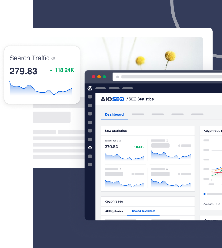
I recommend the All in One SEO plugin. This is an established plugin with thousands of 5-star reviews on WordPress.org. Currently, over 3 million people are using it
What I like about the plugin is:
- Simple interface: It’s easy to use
- Instant analysis: The plugin analyzes all your pages
- Clear action steps: AIOSEO also gives you simple instructions for improving SEO.

All in One SEO will walk you through improving these elements that impact both mobile and desktop SEO:
- Title and meta description optimization: Check for character limits and include your focus keyword
- Focus keyword use: AIOSEO will check to see you’ve included your focus keyword in the title, meta description, first sentence, some subheadings, and some image alt text (if relevant)
- Readability: Each page gets a Flesch Reading Ease Score. This encourages you to write in plain English. AIOSEO also checks for use of short paragraphs and sentences.
- Scannability: The plug checks for adequate use of subheadings as well as images and video (if relevant). This makes content easier to scan, particularly on mobile devices.

In addition, the plugin comes with plenty of additional benefits for SEO, including:
- Automatic sitemaps: These are auto-generated according to Google’s specs.
- Author SEO: This helps you communicate your EEAT to Google.
- Search Statistics: See how you’re ranking on Google and what to prioritize.
For mobile users, pay close attention to:
- AIOSEO Readability checks: These checks will prompt you to use short paragraphs and sentences, and to break up text with subheadings. These features make your content easier to read on small screens.
- Front-loading Your Keyword in Your Title: AIOSEO will check to see if your title begins with your keyword. Given the small width of smartphone screens, many searchers will only pay attention to the first words of titles in search results.

Q&A on Mobile SEO vs. Desktop SEO
Does having your website mobile friendly increase your Google SEO ranking?
Not necessarily. Page experience in general, and mobile-friendliness in particular, are evaluated in a relative way. Google weights quality content above page experience (which includes site loading speed). In addition, other ranking factors will be taken into account when Google’s algorithms assess your pages.
That said, it’s wise to optimize all aspects of your site to increase the likelihood of ranking well for relevant keywords.
How can you easily check on desktop whether a site is responsive?
To use a desktop to check whether a site is responsive, navigate to the site. Then, with your mouse, click on the edge of the browser and narrow its width. Most responsive websites will alter their layout at 2 points: at the average screen size of a tablet and of a smartphone.
If the site layout doesn’t change as you minimize the browser window, then the site is not responsive.
After Mobile SEO vs. Desktop SEO . . .
Now that you’ve learned the key similarities and differences between mobile and desktop SEO, what’s next?
- Learn how to conduct a site audit.
- Check out our mobile SEO tool recommendations and our detailed guide on mobile SEO.
- And discover SEO secrets the pros use to increase revenue.
Come join us on our YouTube Channel to find simple WordPress SEO tutorials. You can also follow us on X (Twitter), LinkedIn, or Facebook to stay in the loop.
Disclosure: Our content is reader-supported. This means if you click on some of our links, then we may earn a commission. We only recommend products that we believe will add value to our readers.
Want to Try AIOSEO for Free?
Enter the URL of your WordPress website to install AIOSEO Lite.